Turning Learning
into Real-Life Application

A virtual map that helps students aged 10–18 apply what they learn in school to the world around them — turning memorized facts into interdisciplinary thinking.
Duration
6 months, 2023-2024
Type
SWU UX Design Lab
Capstone Project
My Role
Lead Product Designer
Led the project end-to-end, from research to prototyping.
Team
2 Researchers, 1 Graphic Designer
The Challenge
How might we help students aged 10–18
connect what they learn in school to the real world?
A virtual street-view
to apply learned knowledge
01
Explore a real-world map
The home screen shows your current learning progress and suggests your next topic when you're ready. Scroll down to browse concepts across subjects

02
Learn a concept, at your level
Before entering a Playroom, read through a short concept lesson. Adjust the difficulty to match your level — from introductory to in-depth.

03
Apply it inside a virtual everyday space
Step into a virtual environment — a street, a café, a park — rendered like Google Maps Street View. Your challenge: spot where your newly learned concept appears in this everyday scene.

03-1
Spot connections and record what you find
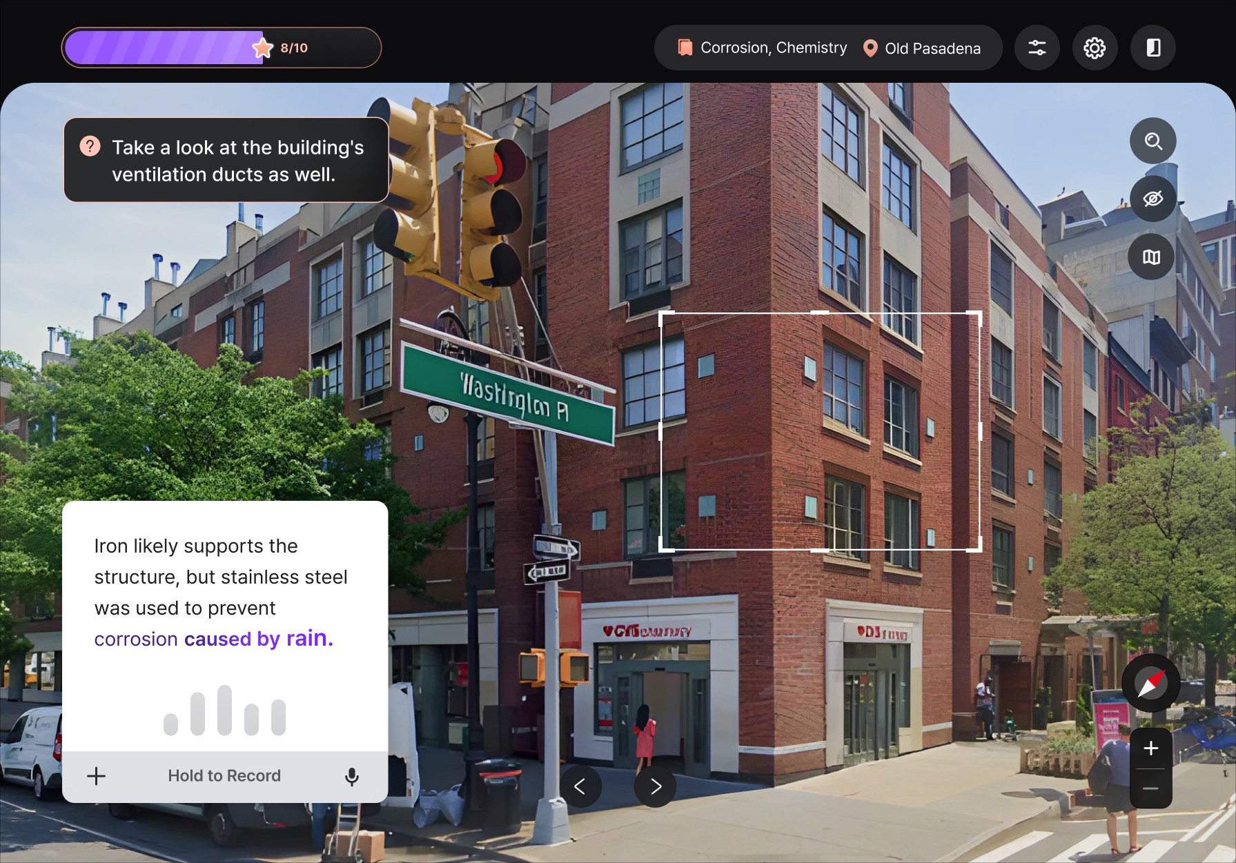
Found a connection? Record your observation as a note, drawing, or voice memo. If you're stuck, tap the hint button — it nudges you in the right direction without giving away the answer.

Hint
You can get hints if they're stuck and record ideas in different ways.
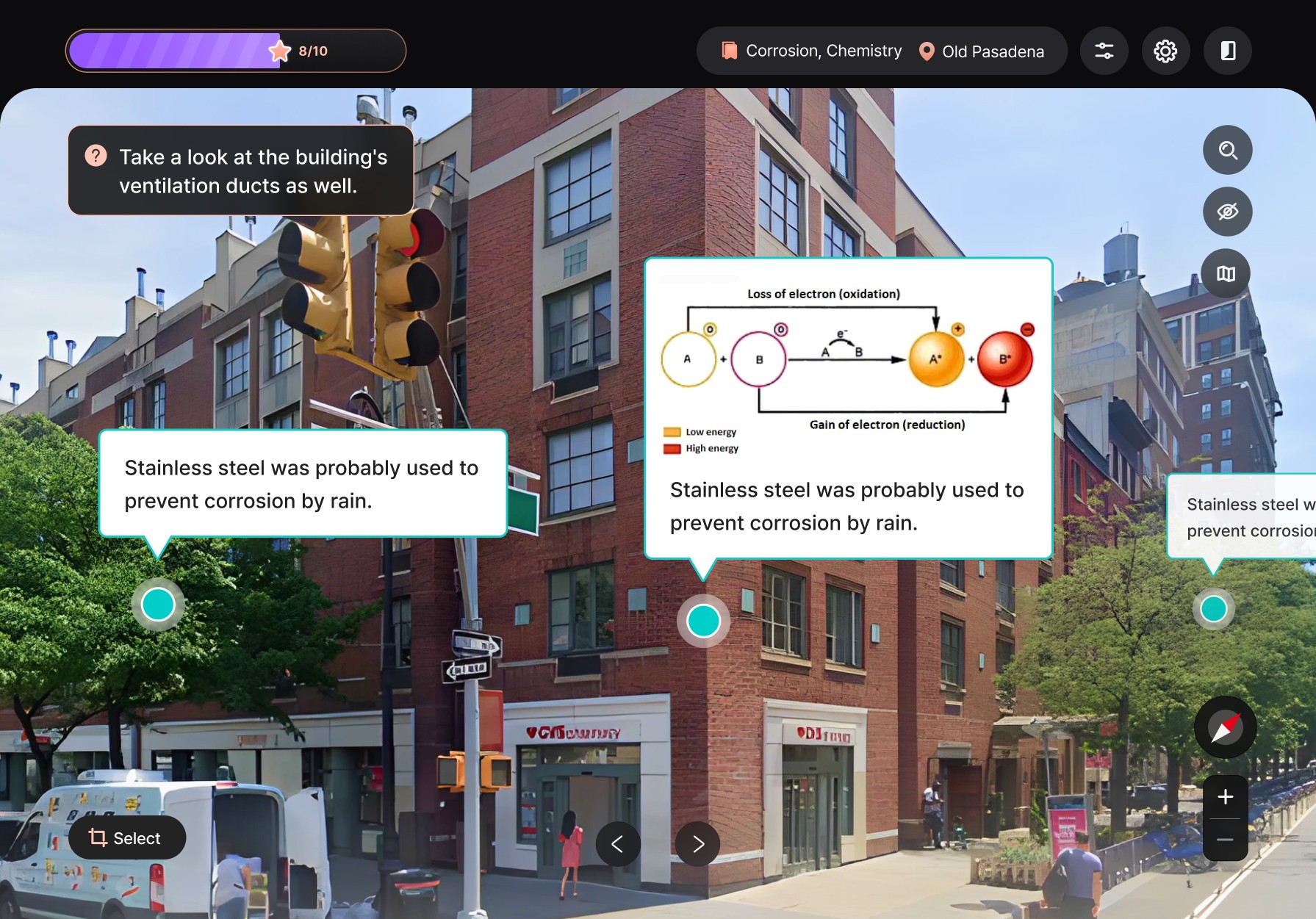
Recorded
After recording, ideas are displayed on the screen for you to revisit anytime.
04
See what you missed — and think further
Once you've collected enough observations, the session closes with a review — your ideas alongside angles you didn't catch. See how others applied the same concept differently, and push your thinking beyond your first instincts.

Context
Learning from textbooks and lectures doesn't truly last.
Students learn knowledge from various fields at school, attending lessons from teachers and solving problems.

User Research
What's the problem with education?
I conducted in-depth interviews with 3 Influential users, a teacher and three parents, and 5 children to get insights.
1. Single-case analysis

2. Cross-case analysis

3. Correlatioships between insights

4. Empathy map

Teacher
"I teach across fields to grow interdisciplinary thinkers — but I can't measure if it's working."
At school, teachers teach a variety of knowledge. The reason is to use this knowledge to cultivate interdisciplinary thinking in students. This leads to problem-solving and originality.
Parents
"I don't know how my child is learning — so I sign them up for everything."
Parents often don’t clearly understand what or how their children are learning, or which methods are most effective, so they send them to multiple private academies to provide as much education as possible.
Students
"I forget it fast. The textbook and outside feel like different places."
Students acquire a wide range of knowledge, but it often fades quickly and does not lead to an improvement in their diverse and integrated thinking skills.
The Problem
Textbook-based learning makes it difficult for students
to apply what they’ve learned in real-life situations.
Market Research
Why the current market can't solve this problem.
Existing edtech products optimize for content delivery, memorization, or gamified habit. None of them are built around the act of applying concepts to the real world.
Today's educational apps focus on what students learn — not how they use it.

Solution
A virtual map to apply acquired knowledge in everyday life
I decided to create Playrooms, a virtual map of reality, inspired by Google Street View. In Playrooms, users can apply newly acquired knowledge across various fields to everyday encounters. This assures that the online platform can help users broaden their understanding on the world.

Deliver
Design Principles
Defined four principles that shaped every screen before desiging the screens
01
Enjoyable
Observing the everyday with fresh eyes should feel rewarding in itself — not like homework dressed up.
02
Accessible
Cross-device support and adjustable difficulty so students can engage often, in short sessions, on whatever screen they have.
03
Immersive
Full-bleed environments and a quiet UI so the learning loop, not the chrome, holds attention.
04
Solo, but shareable
The student's own thinking comes first. Peer perspectives appear only in the review step, expanding viewpoints without competing.
Deliver
Service Blueprint
Defined four principles that shaped every screen before desiging the screens

Deliver
Wireframing & Usability Testing
Iterated from low-fi to mid-fi prototypes, then ran unmoderated usability tests across 3 aspects — UX writing, accessibility, and overall usability. Tested with my UX lab advisor and a teacher (internal), and 5 students aged 8–15 (external).

Iteration 1
Making the "choose what to learn" moment feel like discovery

Before
The original landing screen led with a directory-style list of topics. Test users — especially younger ones — described it as "school-y" and scrolled past the value proposition.

After
Replaced the directory with a streaming-app-style "Recommended Playrooms for You" rail, a progress hero, and curiosity-driven category chips. The page now invites rather than instructs.
Iteration 2
Helping students who got stuck inside the playroom

Before
Students often paused mid-session with nothing to grab onto, and abandoned the playroom. There was no scaffolding for "I don't see anything to say about this."

After
Added a peripheral hint button (top-left) and replaced the muted side panel with saturated highlights on actionable elements. Hints offer a starting observation, not the answer.
Iteration 3
Letting students feel that they learned something

Before
The session ended quietly with a "great job" screen. Students said they wanted to know what they missed — not just that they finished.

After
Added a closing "10 more ideas" review carousel comparing the student's observations with peer perspectives they didn't notice.
What I've learned
Depth of Problem Definition
At first, the problem was defined broadly as Gen Z not fully utilizing bookmark data. Because it was too broad, the solutions were vague and scattered. Once the focus narrowed to issues within the current search system, the solution became much clearer.
Understanding the Ecosystem
Initially, I assumed this was mainly a problem for content consumers, so I only interviewed consumers. However, when designing, I realized the solution could also benefit creators. By looking at the entire ecosystem, the ideas became more realistic and cohesive.
Importance of Iteration
By creating multiple versions (A, B, C, D), I experienced how iterative design makes solutions more practical and user-friendly.