Design Lab
I love exploring different types of visual design such as motion design, typography, and branding and finding design principles.
(Motion Design)
Design Principles
Think about the movement of real products.
Thinking about materials like pudding, jelly, or ski goggles helped me understand how movement should behave to look realistic.
Easy Ease makes movement look real.
When applying Easy Ease, we should give the motion time to slow down naturally. This makes the movement feel more realistic.
Smooth transitions between movements.
I should always think about how shapes will change. This helps me decide which tools to use when creating shapes and transitions.
(Editorial Design)
Design Principles
Layout should align with the branding tone.
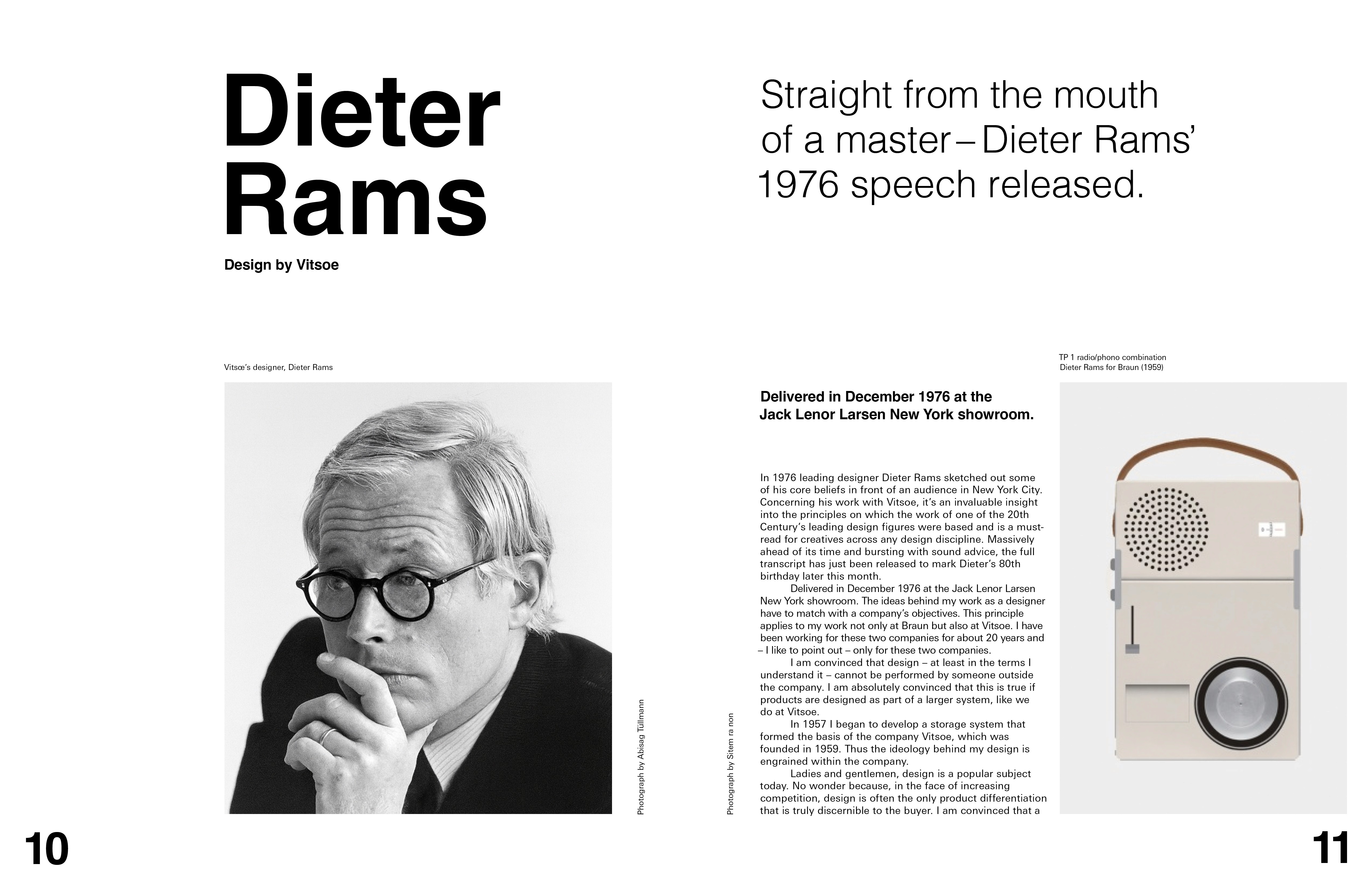
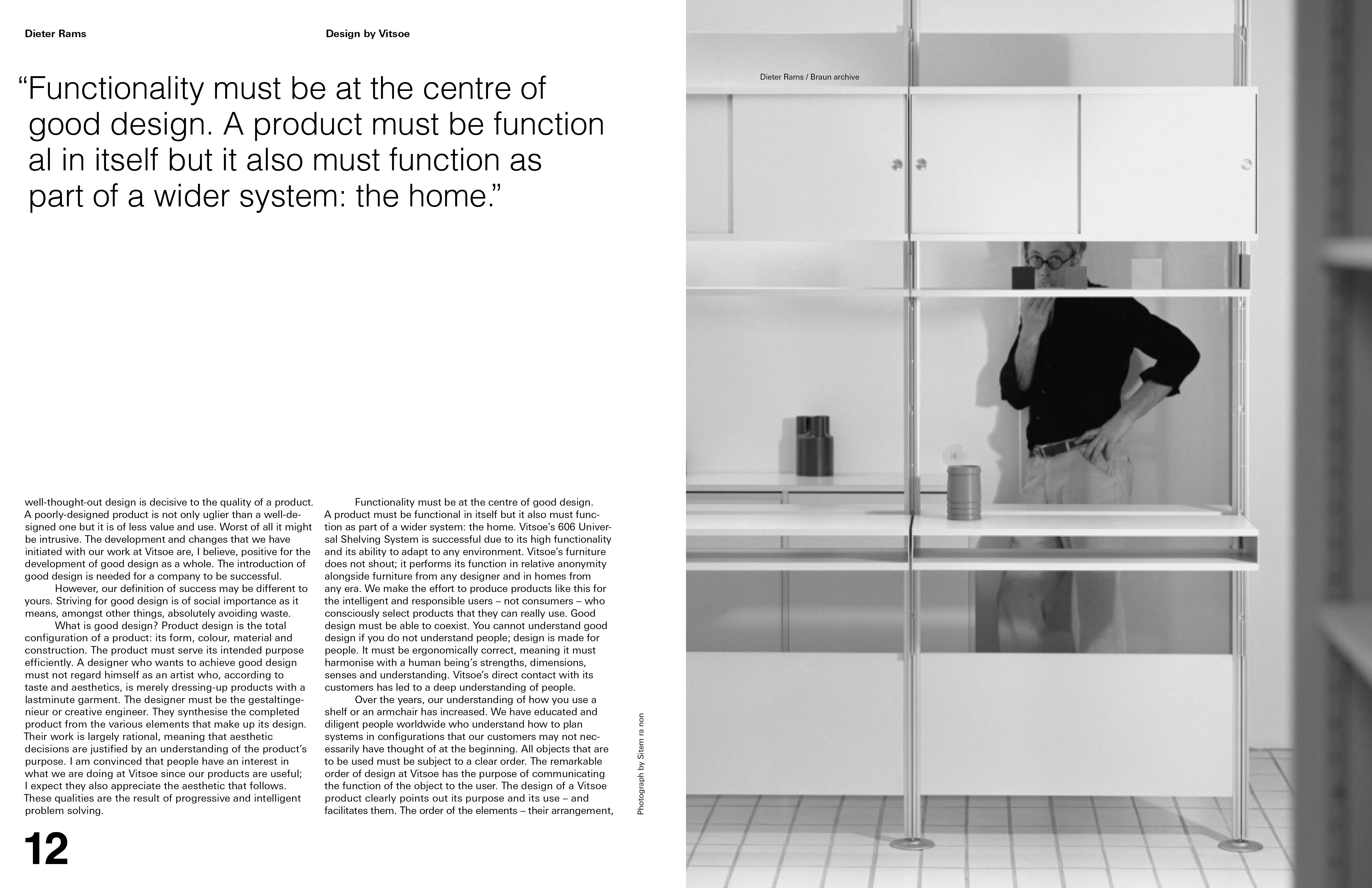
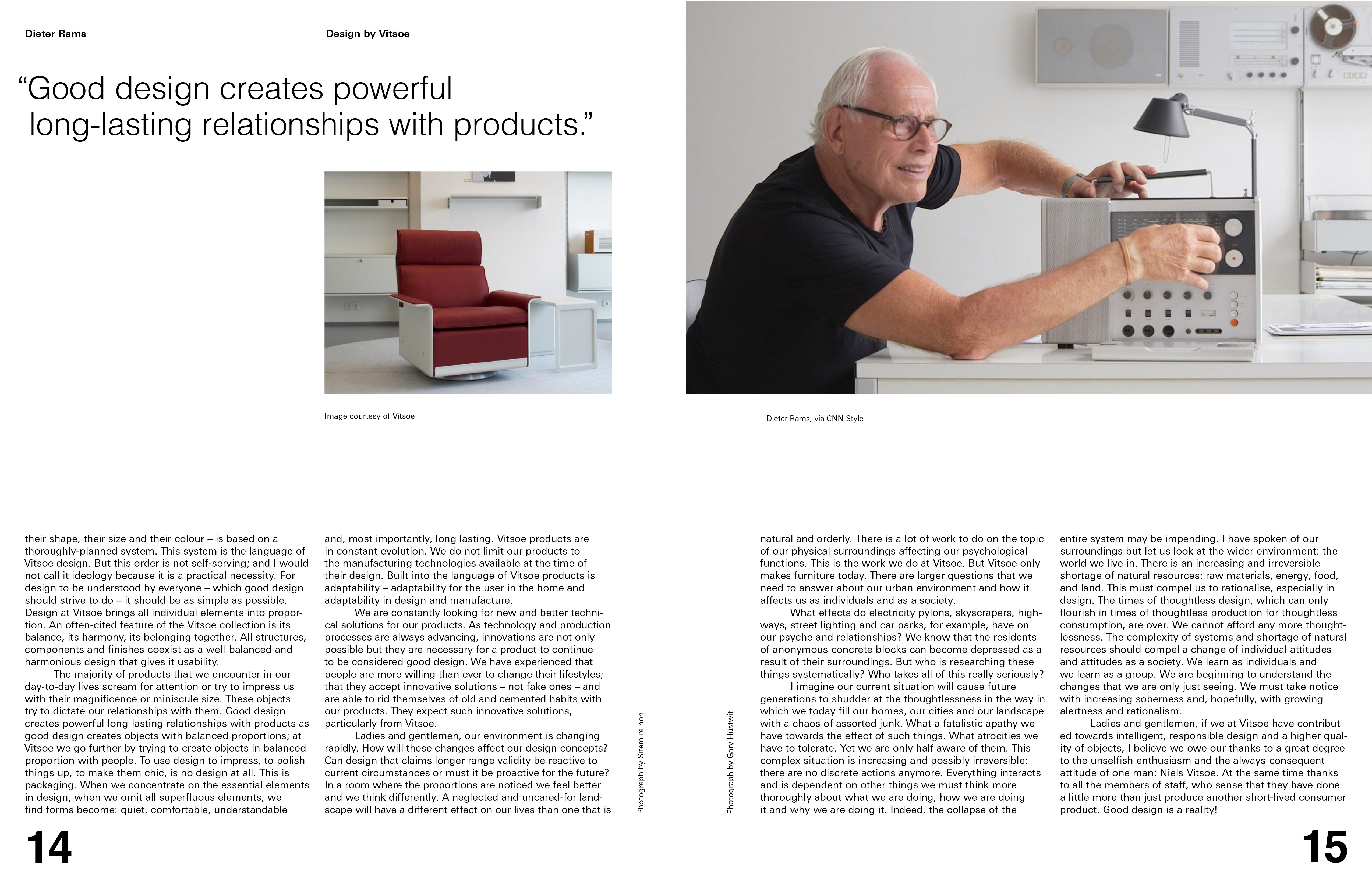
I chose a stable two-column layout instead of three columns to match Dieter Rams’ simple and calm design language. Layouts also require systems thinking aligned with the brand.
Consistent layouts with subtle variations.
Keeping consistency in header positions, body copy alignment, and captions improves readability while allowing small variations for rhythm.
Kerning affects readability.
Kerning should support readability and adapt to the content. Careful decisions around spacing and text size help improve clarity.